Logo Design for Printed Materials: A Comprehensive Guide to Getting It Right
Logo Design for Printed Materials, The feeling of having a beautiful printed business card in your hand and the logo that appears absolutely crisp is very satisfying. Having worked in the fifteen years with print shops and design studios I have seen a great number of logos that looked beautiful in the display but crumbled up as soon as ink was put on paper. It is not an exceptional situation, yet it can be completely prevented.
I should take you through the basics of designing logos to be used on printed materials because, yes, it is a very different task than designing digitally only.
Knowing the Basic Disagreements.

When you are designing on screens you end up working with light. Colors are bright, details are clear and everything shines with that back lit brightness. Print is the very different thing. It has to do with ink absorption, paper texture, and the constraints of printing technology.
I recall one of my clients who presented himself to me in a very angry manner. She had spent money well to get a logo that was beautiful on her web site, yet her business cards were blurred and her yard signs were barely readable at ten feet. The designer who first came up with it had never thought how the logo would be translated to print.
This has been occurring more frequently than you would have thought. A logotype created without following any print considerations will usually feature mostly thin lines, which vanish, slight but noticeable color ramps, which turn into blobs as well as minute details, which end up being little more than smudges.
The Technical Requirements Essentials.
And assuming that I could had a single piece of advice to tattoo on the forehead of all designers, this would be it: to create logos always in vector form. Software such as Adobe Illustrator or Affinity Designer generates scalable files (usually in form of an .ai, .eps or .svg) which can be scaled indefinitely without loss of quality.
The normal JPEGs and PNGs are made up of pixels. Explode them to get a billboard and you have a pixelated mess. I have witnessed how firms have been caught up with useless logos as nobody retained the original vector files. Don’t let that happen to you.
The Color Mode is More of a Issue than You Think.

Screen displays are done in RGB (Red, Green, Blue). CMYK (Cyan, Magenta, Yellow, Black) is print. Such color spaces cannot be translated exactly and that bright electric blue on your computer screen may appear on paper as a dark navy blue.
A print work should always be designed using CMYK values. Better still, use Pantone color of pivotal brand names. The formulations of inks used by Pantone are standardized and provide uniformity through vendors and materials across the various print vendors.
Print Designing
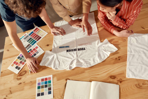
The work horses of print branding are business cards. Your logo must be readable in tiny sizes -usually not more than 2 inches wide. I would advise the logo to be tested at the real size before deciding. Write a test sheet and scrutinize it. Are you able to read any text components? Do thin lines hold up?
In the case of letterheads, how the logo will be interacting with the typed text. Is it going to be located in a corner, or does it have to serve as a watermark? This requires moderation and conciseness.
Signage and Large Format
Here’s where things flip. The same logo that seemed fabulous on a business card would be feeble on a store front sign. Big format printing – banners, billboards, vehicle wraps – need more assertive lines and less decorative forms that are effective at a distance.
I had a restaurant chain in which the logo had elaborate fork and knife drawings. Beautiful in menus, thoroughly lost on their roadside signages. We got a simplified version that is used in large applications.
Packaging and Product Labellings.
There are also other variables presented by product packaging: metallic inks, embossing, various substrates. A logo on a cardboard box is not going to act like a logo on a glossy plastic or on a textured paper.
Insist on having physical evidence before taking up production runs. What appears good on a web mockup can shock you in the real world – and it will occasionally be a pleasant shock, other times it will not.
The Principles of Design Practicality.
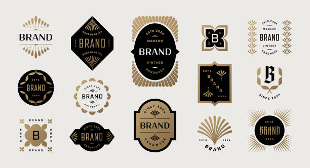
Simplicity wins. The most effective and memorable logos are the simplest ones. Consider how the swoosh or the apple used by Nike or Apple have perfected their use in all possible situations.
Create multiple versions. Create horizontal, vertical and icon only. Support dark background reversed versions and simplified versions to use in small applications.
Mind your minimum size. Set rules on the size of the logo that can be reproduced and still readable. This would ensure that the intentions of well-intentioned marketers would not reduce it into a nonexistence.
Mistakes that Ive Often Fallen Victim to.
In print, gradients are banded but on the screen, they are beautiful. Anything less than 0.25 points was likely to disappear. Tiny text becomes illegible. Colors based on the RGB brightness appear to be flat and unsatisfactory when applied in CMYK.
Probably the greatest fault is to design once and stop. The technology of different print is different, paper stock varies and what may have been good on an offset print may not be good on a screen print or even on a digital press.
Final Thoughts
When it comes to designing logos used in printed materials, one should think out of the screen. It requires knowledge of material physical objects, printing, and practice. The additional effort will provide logos that can be depended upon regardless of whether they are embroidered on a cap, printed on a banner or pressed on a business card.
Frequently Asked Questions
What file type would you like logo materials printed in?
Demand such request vectors as EPS, AI, or PDF. These are scaleable and provide all the flexibility allowed to printers.
What is the reason that my logo appears different on paper and on the screen?
Screens consist of RGB color (light based) whereas printers are CMYK (ink based). These color spaces do not correspond perfectly hence they produce differences that are visible.
How big should the business cards be?
The amount of width mandated to be at least 0.5 inches is usually sufficient to be read, but it depends on the complexity of your logo.
Should it be printed in gradients in my logo?
Gradients should be avoided as much as possible. They have the ability to spike banding and inconsistency across printing techniques.
What are Pantone colors and why do they have any importance?
Pantone colors are standard ink formulations that would make sure that the colors are reproducible across printers and materials worldwide.
What number of versions of the logo do I require print versions?
You must have full color, single color and reversed (horizontals and stacked layouts).